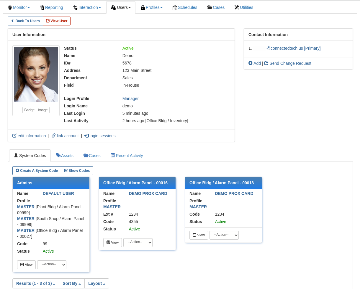
The browser version and mobile apps both benefit from the updated look and feel, but don't worry - we've ensured the same functionality and general layout of actionable buttons for a consistent experience without re-training necessary.
The updated look should bring about an improved sense of intuitiveness and ease of use, especially in the mobile apps.
 |
| User Information |
We've also improved dark mode support for an improved experience in dark mode as well.
 |
| User Edit (Dark Mode) |
The new card style layout helps to show relevant record information at a glance however in the browser version if the original list style is preferred it can be toggled at the bottom of the page, choosing either the new Card or original List layout. Further if the user wants to retain their preference across sessions they can easily set that preference by going to Account->Prefs->Layout and save their choice.
 |
| User List |
 |
| User Preferences |


